Dashboards in AnyDB already give you a powerful view of your data — but we know that numbers aren’t always enough.
We’re working on visual chart components (bar, line, pie, and more) to embed in your dashboards, giving teams the clarity to spot trends and act fast.
Think real-time sales performance, HR trends, task velocity, and more — at a glance.
Upvote this if: you want to turn your business data into visual insights that drive decisions.
The examples in the Chart cell documentation show the X-asis data as a reference to an (hidden?) field containing an array of [data, data] next to the chart cell.
But how does that field get these values in its array? I tried Map() but with no success. The Chart Cell documentation should give more explanation about dynamic field-values from child records instead of only static arrays.
Noted, we will improve the documentation.
But in general say you want a series of data values from Children Records.
You can set X cell as C@CURRCELL!{{Name}} which will return [‘John’, ‘Mary’, ‘Smith’]
You can set Y cell as C@CURRCELL!{{Amount}} which will return [20, 50, 200]
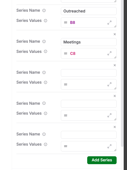
now in your chart you can simply set X series as the X Cell value and Y series as the Y cell.
the difficulty is that the Children’s field is numerical but must be converted to string.
Never mind. I added an extra hidden field (single line text) with formula = A2 (which is numeric field). And the conversion from to numeric to string goes automatically. Nice. Now this hidden field can be used for the x-axis.
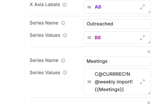
I tried to set the Series Values direectly with a formula. But that doen not work.
It seems that you can only use the formula to point to a Cell which contains the result of the shown C@CURRREC formula?